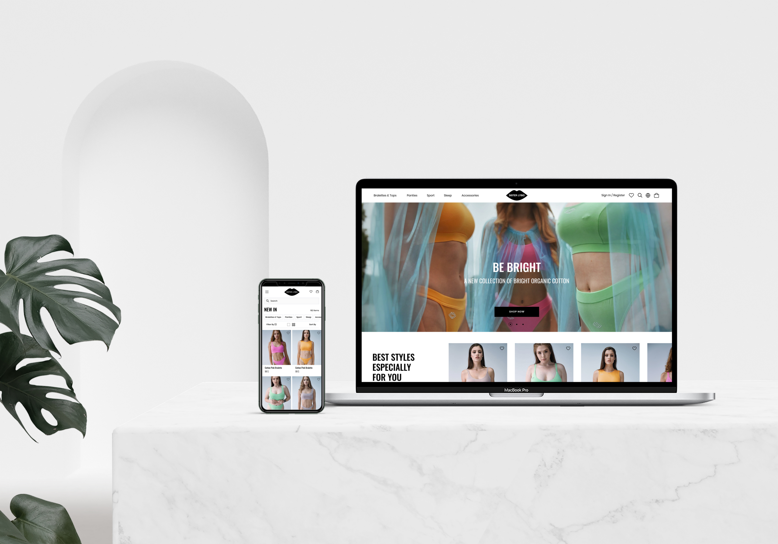
Project Overview
Sister Lybid, a women’s lingerie brand, launching exclusively online with no physical stores.
The goal of the project was to create a website that effectively showcased the brand, built customer trust, made online shopping easy and minimize product returns.
The catch? I was the sole designer, working with tight deadlines and a limited budget. This meant every design choice had to be intentional and strategic, ensuring the website wasn’t just visually appealing but also highly functional. Every detail had to contribute to a seamless shopping experience and build customer trust. No pressure, right?
PROJECT TYPE WEBSITE DESIGN | E-COMMERCE
DURATION 2 MONTHS
ROLE UX/UI DESIGNER, UX RESEARCHER, UX WRITER
TOOLS FIGMA, ADOBE CREATIVE CLOUD, MAZE

Context & Challenge
As a woman who loves the convenience of online shopping, I’ve often faced frustrations when it comes to buying lingerie—especially bras and tops. It’s not just about finding the right size – it’s about finding something that fits comfortably and looks great.
- How can I tell if a certain style will suit my body shape?
- Will the fabric stretch enough?
- Is there enough support?
These are the kinds of questions that can make online lingerie shopping feel like a gamble, leading to frequent returns and a lot of dissatisfied customers. This isn’t just a problem for shoppers—it’s a serious issue for businesses too, as high return rates mean lost revenue and, more importantly, lost customer trust.
Launching Sister Lybid from scratch without any offline presence added another layer of complexity. The website had to do all the heavy lifting—attract, inform, and convert visitors—while reducing the likelihood of returns. In such a competitive market, the stakes were high; a strong first impression could make or break the brand’s success.
The challenge was clear: we needed to create an online shopping experience that truly reflected the brand, ensured customer satisfaction, and minimized returns.
This wasn’t just about design—it was about solving a real problem and redefining how women shop for lingerie online.
Research & Insights
Lingerie Shopping 101: Insights into what drives lingerie shopping choices
Since the target audience was women, understanding what drives their decision-making when shopping for lingerie was essential. I started with online surveys and on-site interviews to gather insights into their preferences. With a tight budget, I conducted surveys in Instagram (yes, it’s not just for selfies 😎) and was pleasantly surprised by how willing people were to support new brands and budget-friendly projects. The insights were clear: customers valued detailed product information, trusted size guides, and wanted to connect with the brand’s story.


Competitive insights
I reviewed e-commerce platforms such as Amazon, review aggregator sites (Trustpilot), and social media platforms (Instagram, Facebook groups and pages) to see how other brands address—or fail to address—the common challenges in the market. By analyzing user reviews, I identified patterns in customer dissatisfaction to uncover areas where competitors may be falling short and where opportunities for improvement exist.

Also, I looked at how competitors handle size selection for bras and tops. Most had detailed size charts with different measurements, but some products didn’t have any guides at all. A few had virtual style assistants, but they weren’t very helpful for picking the right size. Some offered step-by-step guides for measuring manually, which were useful but often took up almost the whole page, sometimes even redirecting customers away from the product page, leaving them feeling lost. Plus, some of the size guides were long and overwhelming, which could be intimidating for customers. There were also no tools to provide help or support during the selection process.

Understanding the brand: Core principles and market position
In addition, I made a list of the brand’s existing values, goals, and market positioning. It’s a straightforward document, not much to look at, but it played a crucial role in keeping track of important details. This list helped me prevent forgetting any loose ends and set the stage for content mapping and user story creation.
As much as I love conducting surveys and interviews with real people, I also love creating personas—it’s like giving all the insights a friendly face and a story, making the data come alive and easier to connect with.
I created three personas to highlight key needs, goals, behaviors, and frustrations. With the brand targeting both the Ukrainian market and international customers from the EU and USA, I made sure the design met a variety of expectations and preferences, offering a tailored experience for everyone.

From browse to buy: The lingerie shopping journey
I put together customer journey maps and user flows to track how users move through the site and complete tasks. This helped me spot areas where the experience could use a little TLC 😜. Think of it like following a treasure map, but instead of gold, I was looking for hiccups and roadblocks. By mapping out each step, I could see where users might trip up or get stuck. This made it easier to fix these issues and smooth out the experience.
Here’s a sample of one of the scenarios:


In the user flows, I mapped out the key paths users like Lily would take to reach their goals, such as browsing for trendy lingerie, checking the size guide, and completing their purchases. I haven’t included the specific flows in this portfolio due to space, and honestly, most of them were hand-drawn (I still love using good old paper & pencil).
time to desigh
Mobile before Desktop
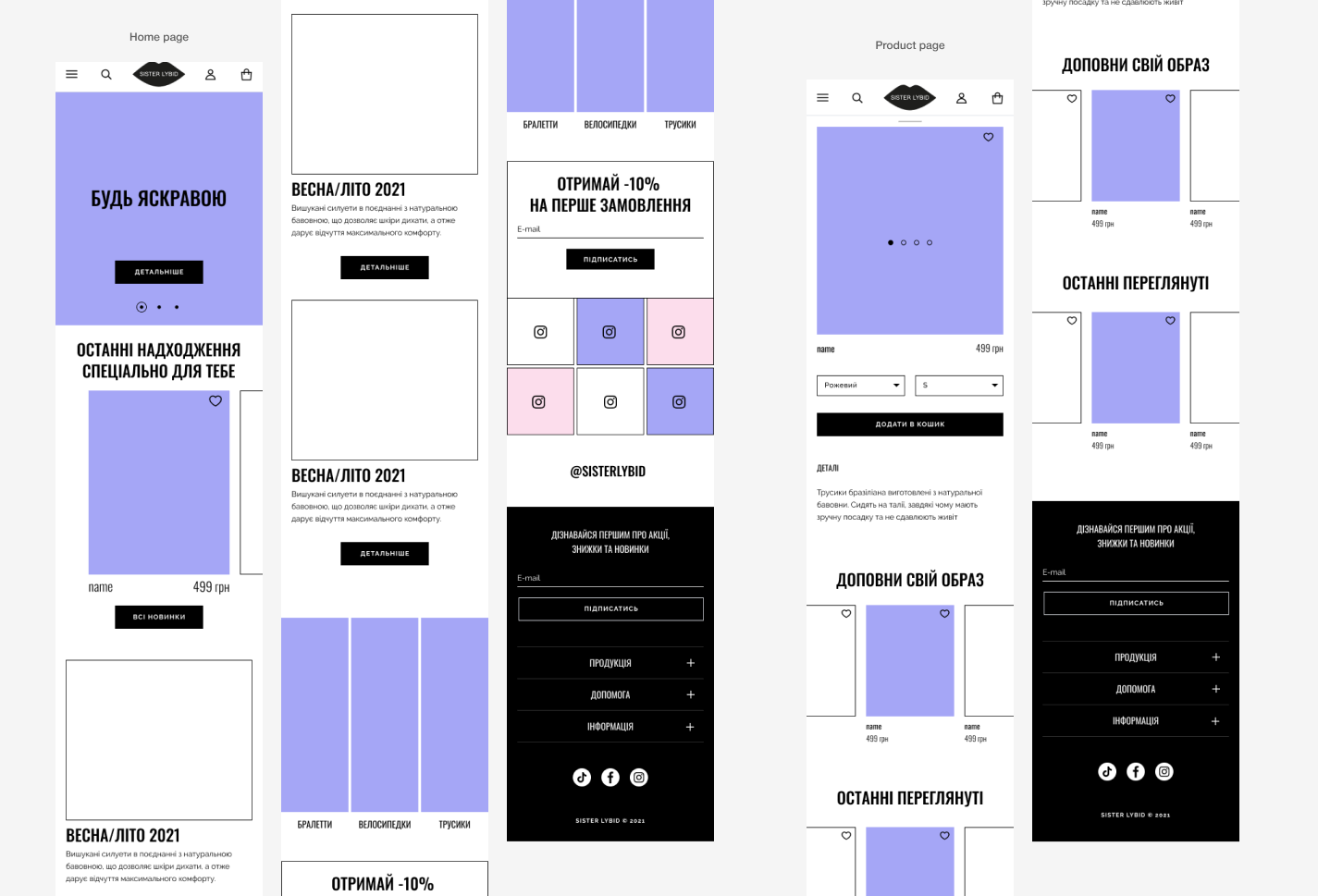
According to a report by Statista, over 70% of online shoppers now use their phones for purchases. With Sister Lybid’s future users being on-the-go professionals, busy parents, and tech-savvy teens, I’ve decided to start with a mobile-first approach. This ensures that the most important features work well on small screens, making it easy for users to access what they need quickly.
After all, no one wants to deal with a slow website while juggling coffee and a toddler!

Finding the perfect fit: My approach to lingerie size guidance
When I started working on the size guide, my goal was to simplify the user experience by creating a clear, accessible tool directly on the product page. Many competitor sites had complex guides that often redirected users away from product pages, leading to frustration and abandoned shopping carts. To improve this, I integrated a straightforward size quiz to help users with measurements and find their best-fit size quickly. By avoiding long explanations and unnecessary redirects, and providing immediate, relevant information, the guide and quiz together acted like a knowledgeable assistant, streamlining the process and allowing users to continue browsing seamlessly.
Trying on my UX writer hat for the first time
This was my first hands-on experience with UX writing, and it was an eye-opening journey. I focused on ensuring that the language across the site—from product descriptions to navigation and CTAs—was clear, concise, and user-friendly. Since it was a mobile-first project, I had to be particularly mindful of space and readability, making sure every word mattered. The goal was to create an experience that felt as intuitive and helpful as having a store assistant by the user’s side, guiding them through the process. This project taught me the importance of balancing clarity with brevity and how impactful well-crafted UX writing can be in creating a seamless user journey.
Usability Testing
Kicks Off
Once the design was ready, it was time to see if it was as functional as it was visually appealing.
Here’s how I tackled it:
- I crafted a testing plan with tasks like browsing products and using filters.
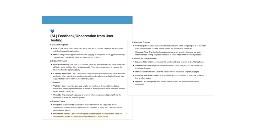
- Conducted 5 usability tests on the Maze platform.
- Reviewed feedback and identified areas for improvement.
- Made design tweaks and copy adjustments based on the findings.
What I was testing for:
- How smoothly users could navigate the site on mobile, from browsing lingerie to using filters and the size quiz.
- Whether the site’s copy—from product descriptions to calls-to-action—was clear, engaging, and easy to follow.
- How users felt about the overall shopping experience—did it feel intuitive and enjoyable, like a personal shopping assistant?

Key Insights & Design Revision
User testing played a crucial role in shaping the mobile design of the product page by revealing what users really needed. One major takeaway was the importance of providing quicker access to key information, like Shipping & Returns and a new Make a Match section. Based on this feedback, I reorganized the page layout to make these details easier to find, helping users make quicker, more informed decisions.
To build trust and guide users in their purchase, I also introduced a Ratings & Reviews section. This allows customers to read reviews based on real experiences, including criteria like fit and product quality. To keep the information reliable, only verified purchasers can leave reviews, minimizing the risk of misleading content.
Additionally, I expanded the Product Details section to include more specific information on fabric, fit, and product features. This helped users get a clearer understanding of the items they were considering, reducing hesitation and increasing overall confidence in the brand.
Before
After
the outcome
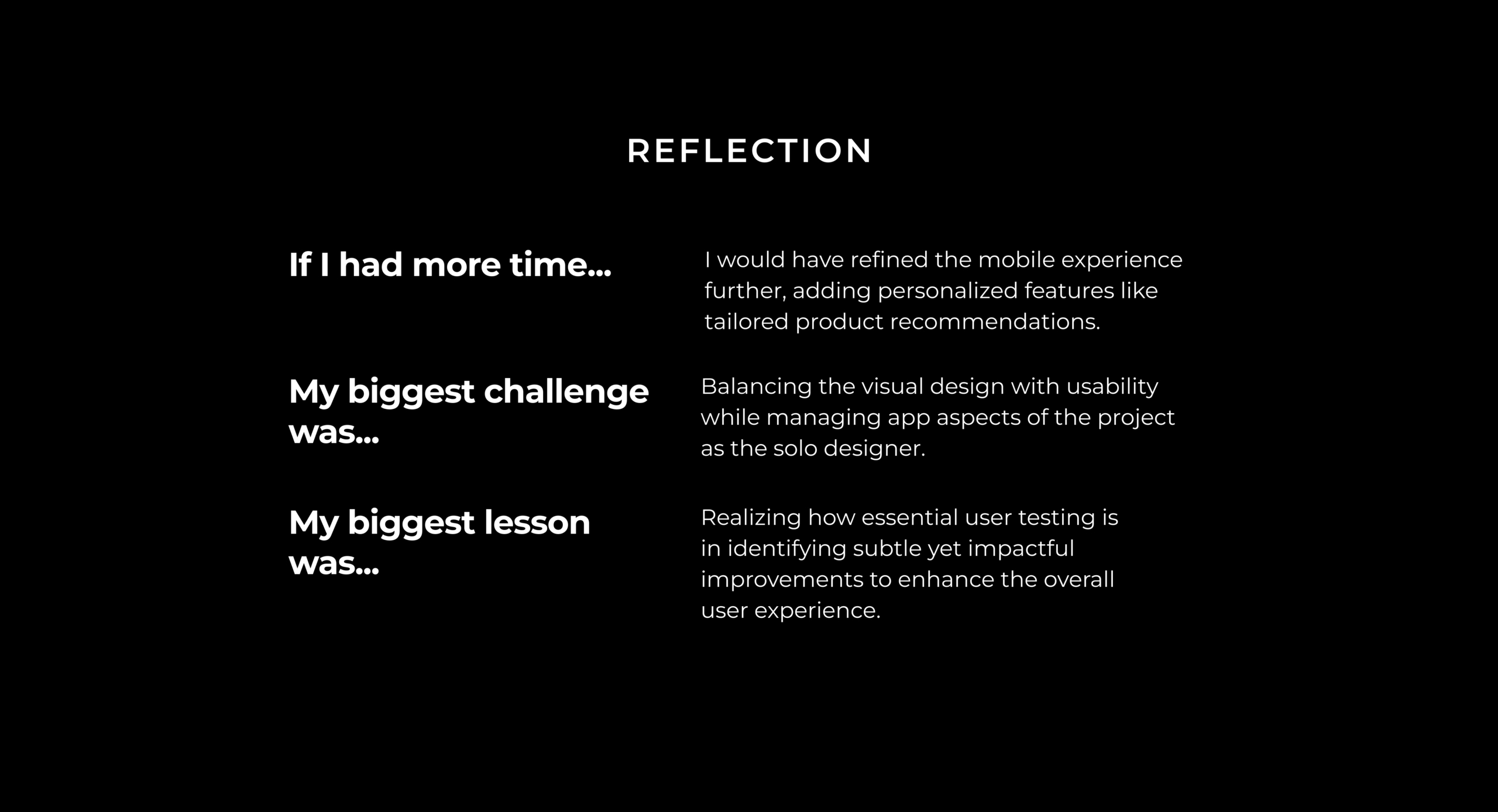
Unfortunately, despite the progress made in developing the website, the project was placed on hold due to a strategic shift from the brand’s owners. They decided to reassess their long-term goals and reposition the brand within a broader market context. As a result, further development on the site, including the usability improvements and new features, has been paused for now. While it’s disappointing not to see the project fully realized, the work completed has laid a strong foundation for future opportunities when the brand is ready to move forward.
