Kakel Store, a Swedish tile company with over 30 years of experience, needed a redesigned e-commerce website to support its growth and expansion into international markets, including Norway, Denmark, Iceland, and Finland.
The focus was on improving usability and creating a competitive online presence.
PROJECT TYPE E-COMMERCE WEBSITE REDESIGN
DURATION 12 WEEKS
ROLE UX RESEARCHER, UX/UI DESIGNER
TOOLS FIGMA
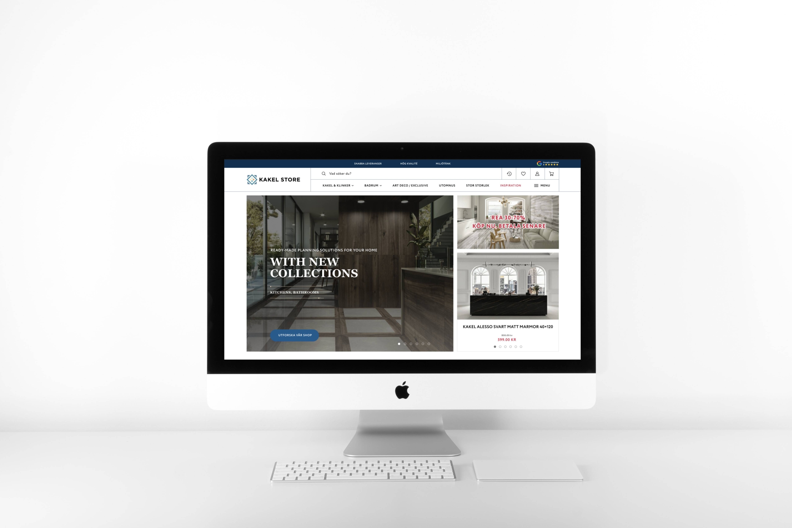
Kakel Store, a family-owned tile company with over 30 years of experience, was expanding into new international markets—Norway, Denmark, Iceland, and Finland. However, their existing website was outdated and couldn’t support the needs of a growing, global customer base.
The main challenge was to redesign the website to be modern, user-friendly, and competitive in order to drive growth in these new markets.
As the sole designer, I was responsible for creating a sleek e-commerce platform that reflected the brand’s heritage while offering a seamless shopping experience for international customers. The goal was to ensure the site could scale with the company’s expanding reach.
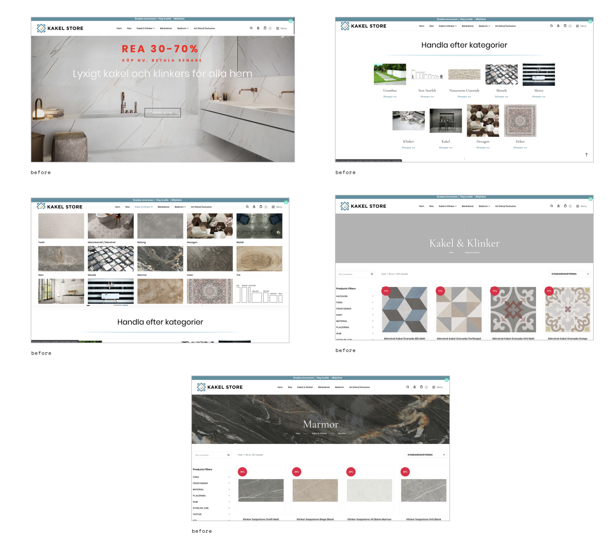
From clutter to clarity
To kick off the redesign, I dove deep into understanding Kakel Store’s users and their needs.
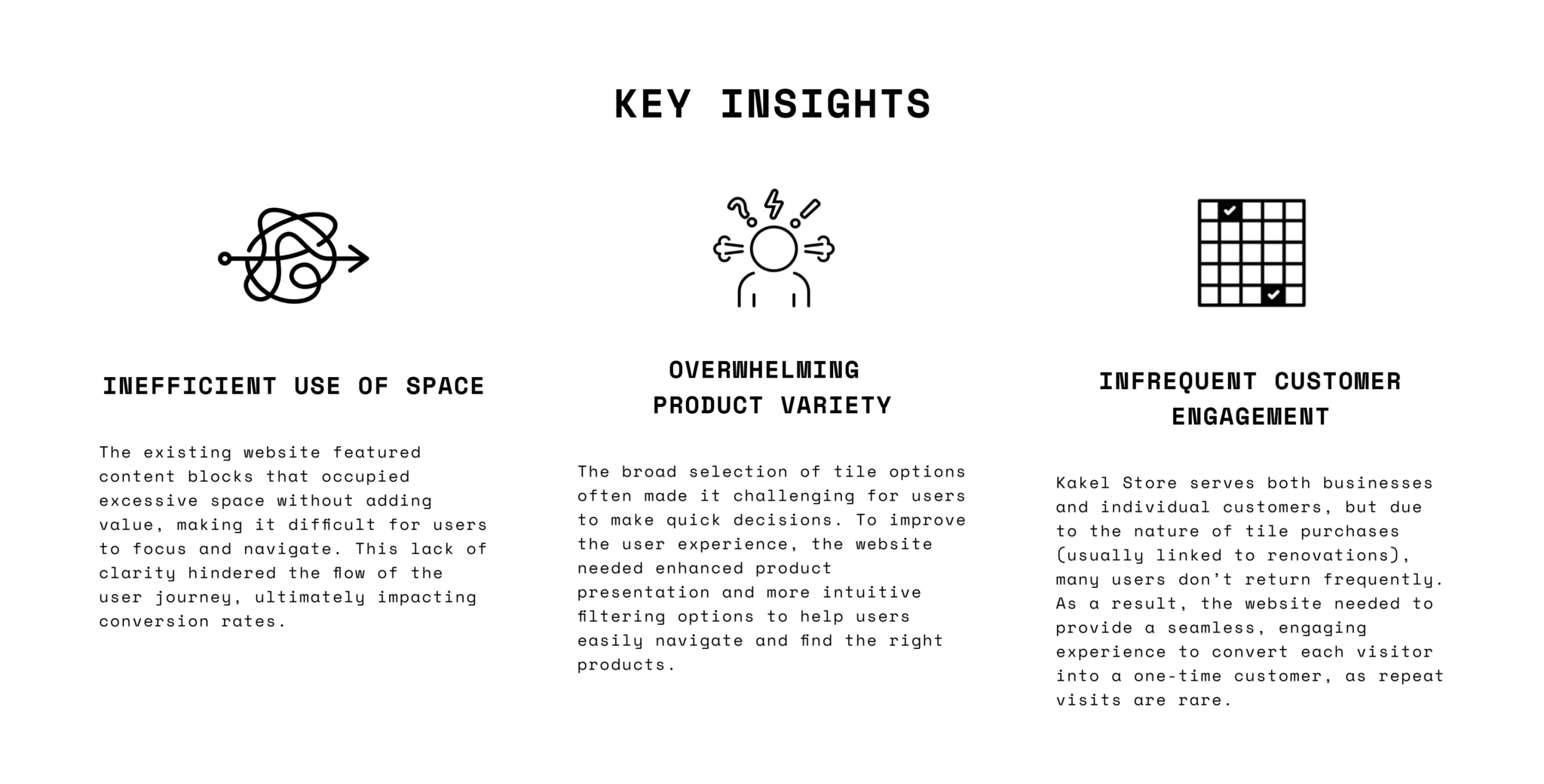
The current site had several content blocks that took up excessive space, making it difficult for users to focus and navigate, which ultimately hindered conversions.
Through secondary research and competitive analysis, I discovered key insights. Kakel Store serves both businesses and private customers, but most users don’t return frequently—tiles are typically needed only during renovations, which happen once every 5-10 years. This meant that while customer engagement needed to be high, it also had to be seamless to turn every visitor into a potential lead.
Additionally, with such a wide range of tile options, users often found it overwhelming to make a decision. To solve this, I explored ways to enhance product presentation and create an easier, more intuitive browsing experience.
Client wish
The client requested that I keep the original website structure intact but with a refreshed design that emphasized material categories like concrete, marble, and others, presented in squares with rounded corners. This gave me a framework to guide my approach while addressing the usability and user engagement issues I uncovered.
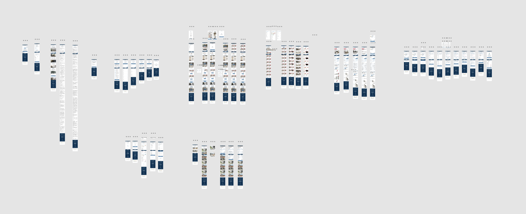
The redesigned Kakel Store website now offers a more cohesive and intuitive experience, with a focus on usability and visual appeal. Key updates have made it easier for users to navigate, explore products, and make informed purchasing decisions.
Improved Product Navigation: The “Shop Page” now includes enhanced sorting options, helping users quickly find the products they need, improving navigation speed and overall user efficiency.
Enhanced Product Viewing: The “Product Page” now features an option to view tiles in various shapes and sizes, giving users a better understanding of product variety and helping them make more confident choices.
Inspiration Page: A new “Inspiration” page was added, showcasing interior and exterior designs with Kakel Store’s products. This feature helps users visualize how tiles will look in real-world spaces, sparking ideas for their own projects.
These improvements have created a more engaging, user-friendly experience that supports Kakel Store’s growth and international expansion.
Conclusion
The redesign of the Kakel Store website successfully addressed key user experience challenges, from improving navigation to enhancing product discovery. By creating a visually cohesive and intuitive platform, I was able to align the site with the company’s expansion goals. The addition of features like advanced product sorting, customizable product views, and the “Inspiration” page transformed the user journey, making it easier for customers to find and purchase tiles.
Future steps
Looking ahead, I would do several next steps to further refine the experience:
