When I took on the freelance project to redesign Hipidy, I saw it as a challenging opportunity to bring clarity and structure to a product still in its early stages of development. The app had a collection of screens but lacked clear functionality, documentation, and a unified vision, making it a complex and demanding project from the start.
The goal was to shape a cohesive, user-centered experience that aligned with Hipidy’s mission and prepared it for a successful beta launch.
PROJECT TYPE MOBILE APP REDESIGN
DURATION 10 WEEKS
ROLE LEAD PRODUCT DESIGNER
TOOLS FIGMA, LUCIDCHART
Unboxing the Unknown
As a product designer, I often join projects at various stages of development. When I received a Figma file with dozens of Hipidy app screens but no documentation or clear direction, I knew there was a challenge ahead.
With limited knowledge about the product or its vision, my first step was to ask the right questions—what was Hipidy’s purpose, what did the app need to achieve, and how could I contribute to its success?

So what is Hipidy?
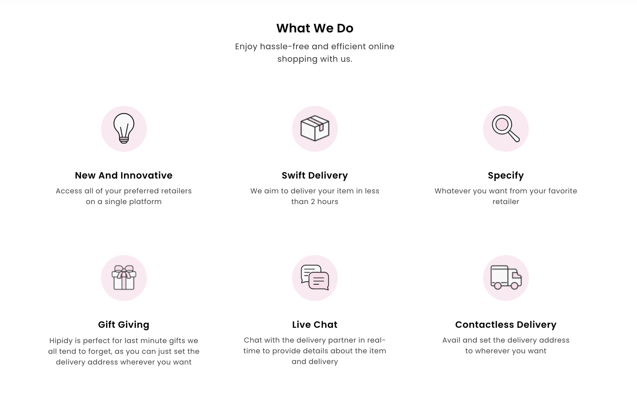
Hipidy is a platform that connects local shops and retailers with customers, offering a convenient way to browse, order, and receive products quickly. It helps businesses stay competitive by adapting to modern shopping habits.
Why does it matter?
The global on-demand delivery market is booming, projected to exceed $350 billion by 2025. With the pandemic accelerating demand for fast delivery, local businesses face increasing challenges. Hipidy aims to bridge this gap by promoting eco-friendly practices and empowering small retailers to thrive in a competitive market.
From redesign to full rebuild
As I delved deeper into the project, it quickly became clear that this wasn’t just a simple redesign. The screens were cluttered, inconsistent, and, most importantly, didn’t provide a seamless user experience. It became obvious that the existing structure couldn’t support both user needs and business goals.
What started as a redesign soon turned into a full rebuild.
My role shifted from focusing on visual updates to rethinking the app’s core functionality, user flow, and overall experience. The original design was fragmented, and to create something that worked, a complete overhaul was necessary.


Aligning stakeholders and defining functionality
The primary challenge in the Hipidy project was the lack of clear functionality across its app ecosystem. This ambiguity made it difficult to establish cohesive workflows or meet both user and business needs. To overcome this, I prioritized stakeholder alignment to clarify goals, streamline priorities, and create a unified vision.
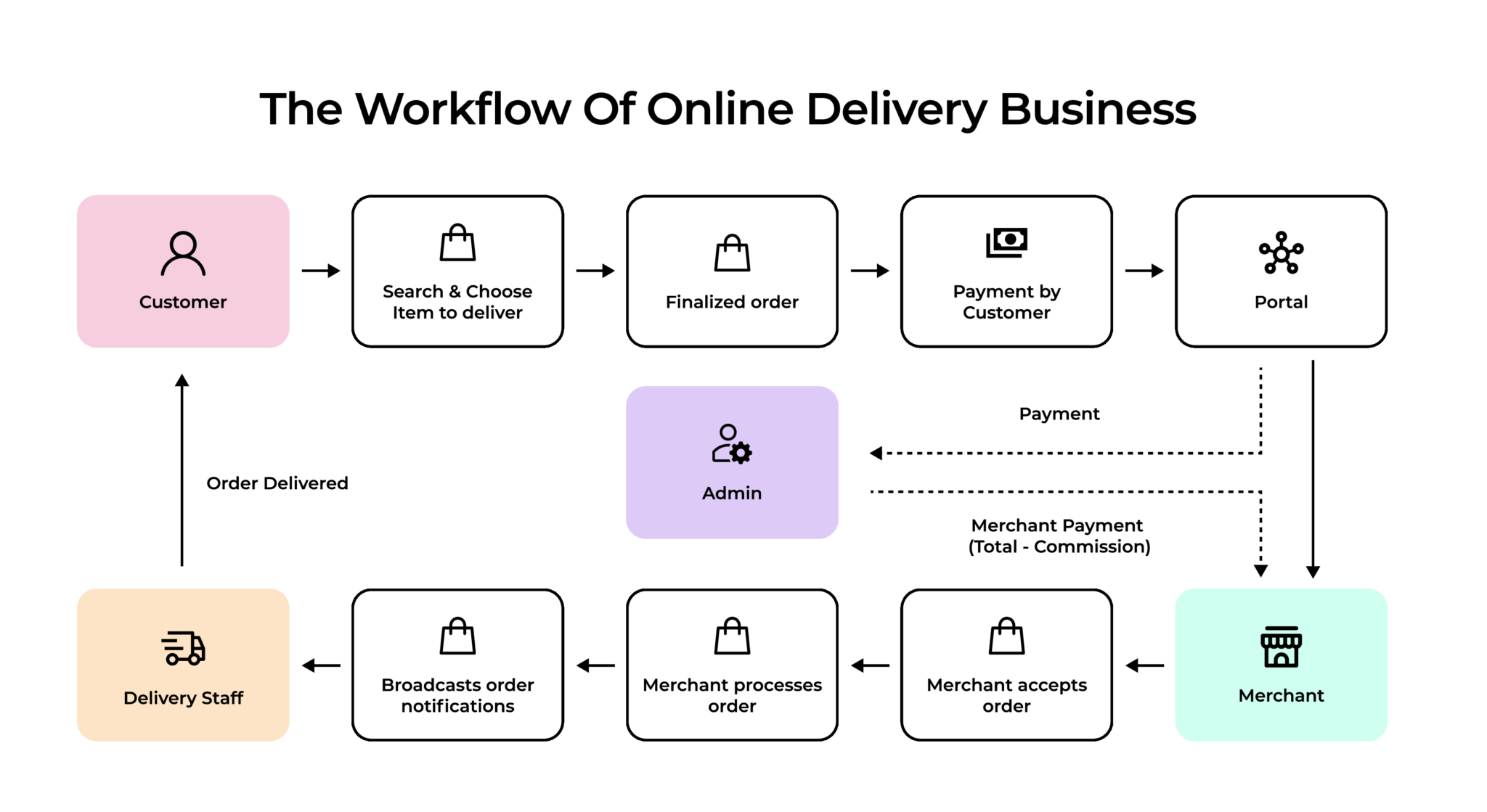
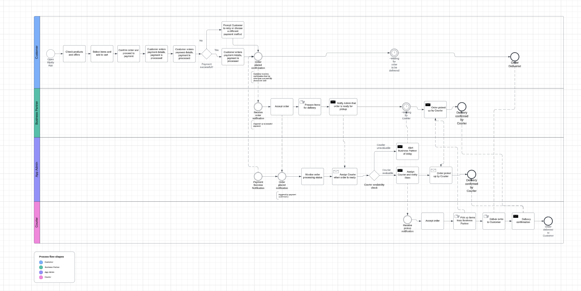
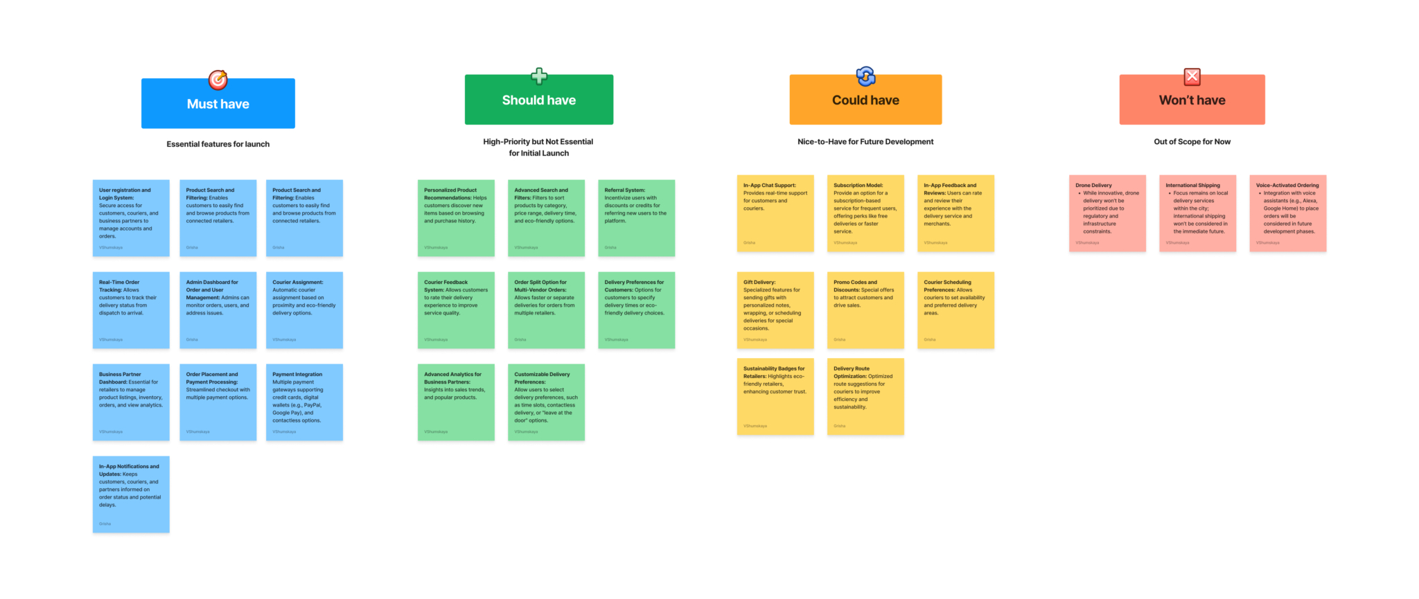
Through collaborative workshops, I mapped the app ecosystem and developed a BPMN (Business Process Model and Notation) diagram to detail the interactions between the Customer, Merchant, Courier, and Admin. I also implemented the MoSCoW method to prioritize features, focusing on what was essential for the beta launch.
These efforts resolved the project’s biggest blocker, ensuring all stakeholders were aligned and equipped with a clear roadmap for moving forward.
Understanding users to shape the experience
With the app ecosystem clarified, I turned to user research to gather insights into the needs and pain points of local shop owners, customers, and couriers. I conducted interviews to understand how each group interacted with delivery platforms and what improvements they expected. These findings shaped user personas, which became essential for designing workflows that addressed specific user needs.

Competitive research
Before moving forward, I conducted thorough competitive research. I studied key players on the market and found several insightful articles about competitors like Glovo (A look behind Glovo’s user experience) and DoorDash (Introducing DoorDash’s Biggest Updates in a Decade). Despite operating in different countries, both companies share similar business and revenue models, focusing on delivering items from local retailers to customers.
I analyzed their user experiences to understand what worked well and what didn’t. This research informed my approach, helping me identify features that would not only fix Hipidy’s existing pain points but also give it a competitive edge.

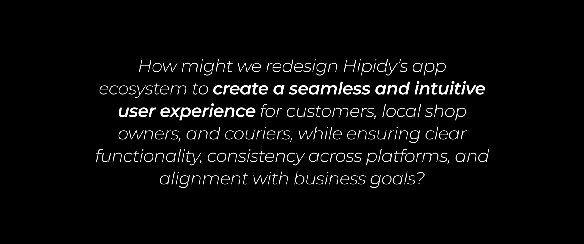
Based on research and stakeholder alignment, it became clear that the core problem was a fragmented user experience, driven by an unclear app ecosystem and inconsistent functionality. The different apps for customers, shop owners, and couriers lacked cohesion, failing to meet user needs effectively. This called for a complete rethinking of the app’s structure and design.

Crafting a cohesive look for Hipidy
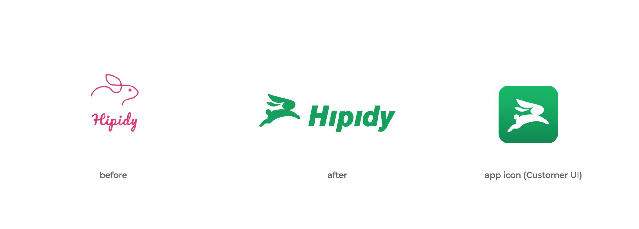
To make the Hipidy brand more professional and cohesive, I took the initiative to refine the logo, giving it a more trustworthy and polished look. A shift from pink to green in the color palette emphasized the brand’s eco-friendly values, while also broadening its appeal.
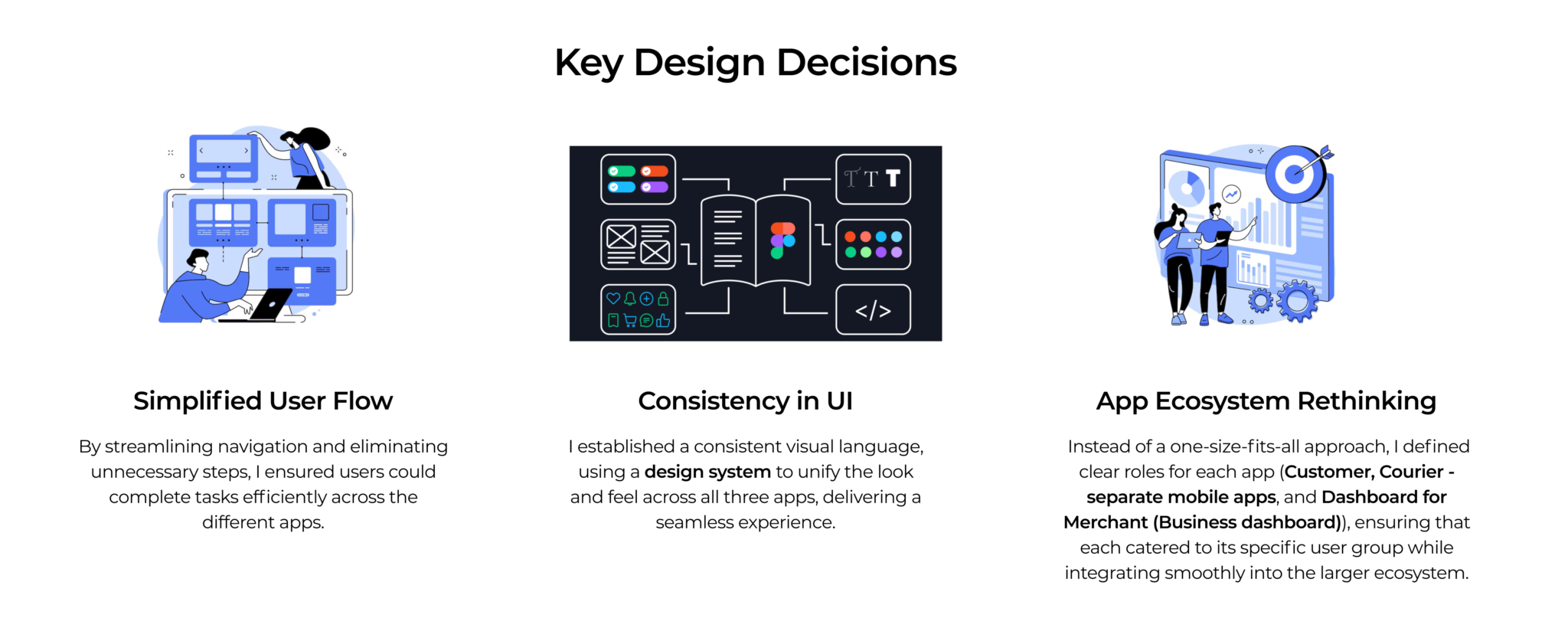
Additionally, I created a comprehensive design system, defining components, typography, and color to ensure consistency and enhance usability across all platforms. The updated color scheme improved accessibility and introduced a clearer visual hierarchy, making the user experience intuitive.
By introducing reusable components, I laid the groundwork for scalability, aligning the design with both business objectives and user needs.
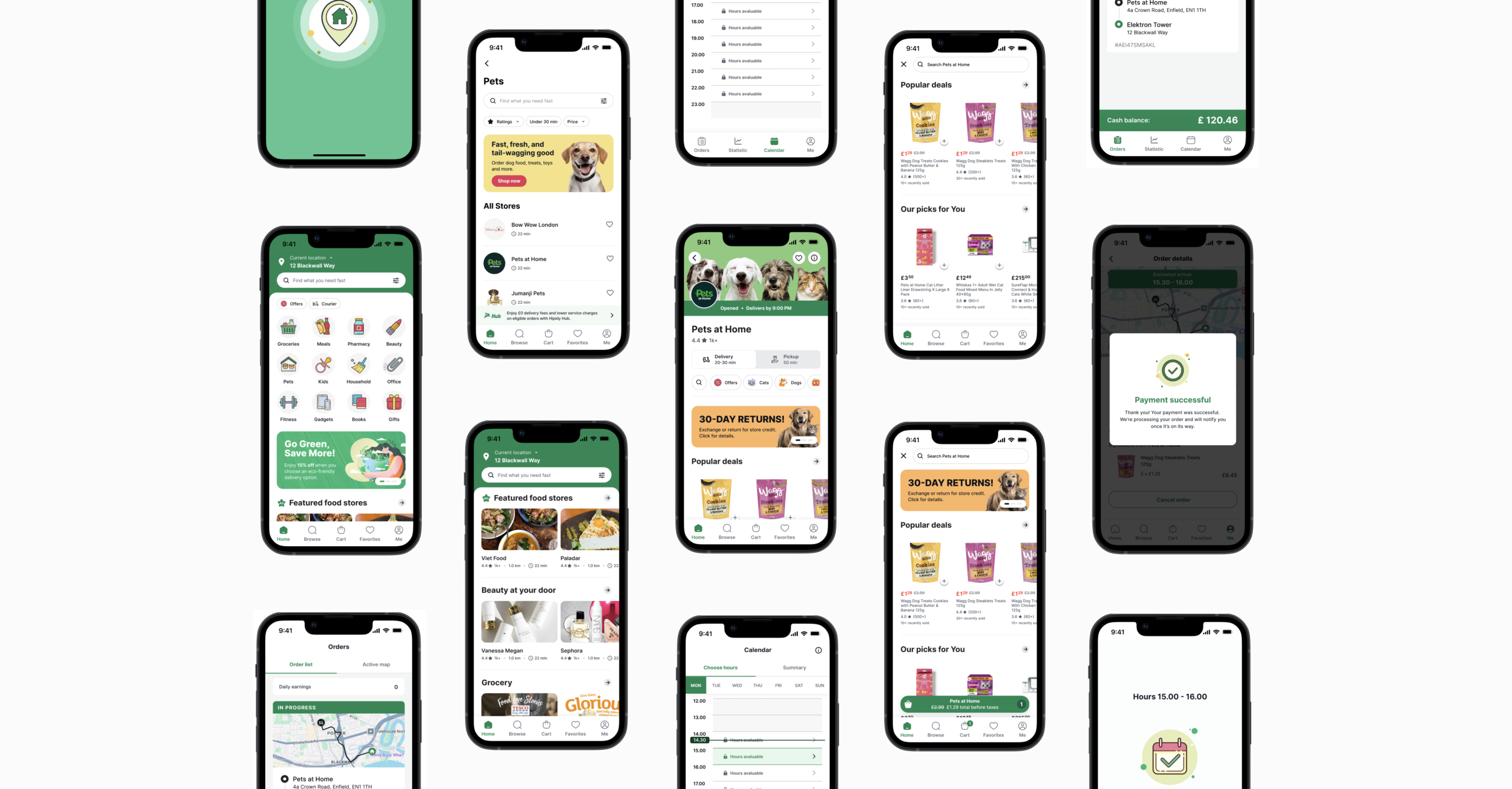
For the beta launch, we successfully developed the Customer and Courier mobile apps, ensuring seamless order placement and efficient delivery management. The Customer app focused on user-friendly navigation and eco-conscious shopping, while the Courier app optimized route handling for reliable deliveries.
The Business dashboard was postponed to prioritize refining core features and gathering user feedback. This strategic choice lays the groundwork for future expansion based on real user needs and insights.
Customer mobile app
Courier mobile app
Conclusion
The Hipidy project successfully established the foundational elements for its beta launch by aligning user-centric design with the brand’s eco-friendly mission.
The Customer and Courier mobile apps delivered on key user needs and supported business objectives, creating a seamless shopping and delivery experience.
Future steps
Moving forward, expanding the feature set with the development of the Business dashboard is essential. This will support retailers and enhance operational efficiency.
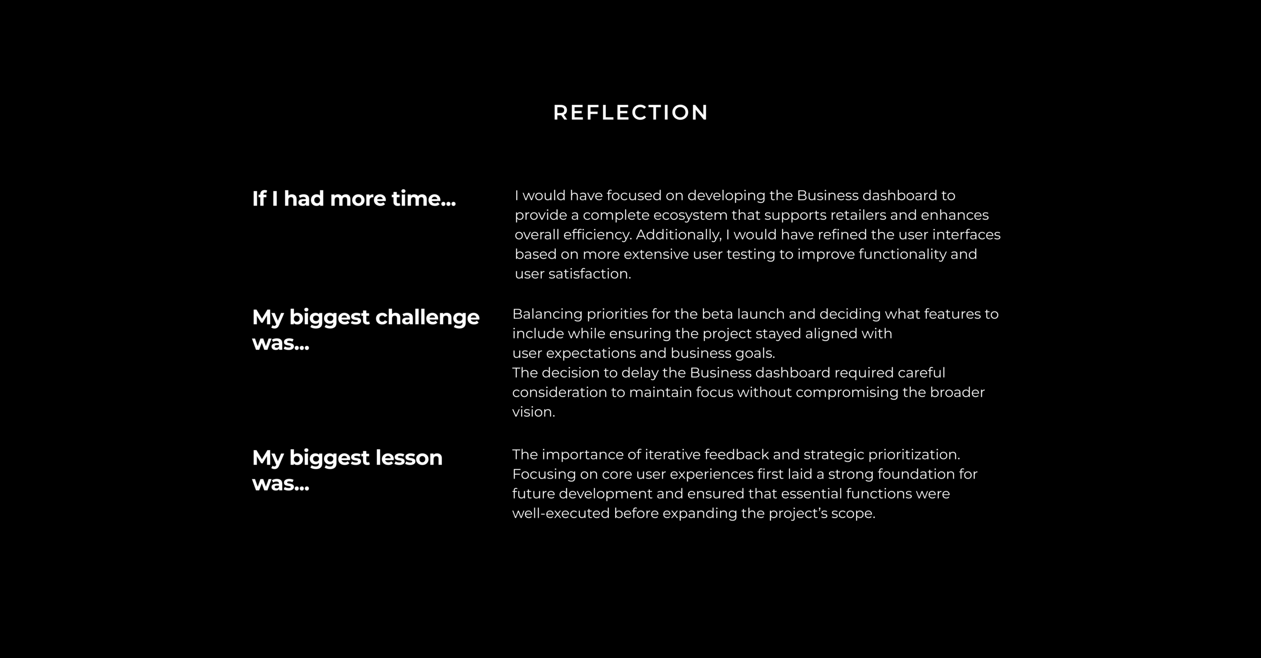
Additionally, iterative updates based on user feedback will ensure continued alignment with both user expectations and business growth goals.
